

Global Super Store (Power BI)
The Situation:
The sales analysis on the Superstore dataset is a comprehensive study that aims to analyze the sales performance of a fictional retail company called “Superstore”. The dataset used in this analysis contains information about sales transactions, customers, products, and geographical locations. Our task is to derive meaningful insights into retail operations and customer behavior.
- Track KPIs (sales, revenue, profit, returns)
- Compare regional performance
- Analyze product-level trends
- Identify high-value customers
- Identify Profitable Products
- Category Level Analysis
- Market Level Analysis
The Data:
The Task: We are tasked with using solely Microsoft Power BI to:
- Connect and transform/shape the data in Power BI’s back-end using Power Query
- Build a relational data model, linking the fact and dimension table
- Create calculated columns and measures with DAX
- Design a multi-page interactive dashboard to visualize the data in Power BI’s front-end
The Process:
1. Connecting and Shaping the Data
Firstly, we imported the data into the Power Query editor to transform and clean it. The next process involved:
Removing Duplicates: Duplicate entries were removed from the dataset to ensure accurate analysis.
Handling Null or Missing Values: For some columns, missing values were replaced with defaults or averages. Null values in “key” columns were removed using filters.
Data Type Conversion: Columns were converted to appropriate data types to ensure consistency. Dates were converted to Date type, numerical columns to Decimal or Whole Numbers, and text columns to Text.
Column Splitting and Merging: Several columns were split to separate concatenated information, or merged to create a unified name (such as Customer Full Name).
Standardising Date Formats: All date columns were formatted consistently to facilitate time-based analysis. This step was important for ensuring accurate time-series analysis in Power BI.
Removing Unnecessary Columns: Irrelevant columns were removed to streamline the dataset. This helped focus the analysis on relevant information, reducing memory usage and improving performance.
2. Building a Relational Data Model
We modeled the data to create a snowflake schema.This process involved creating relationships between the dimension and fact tables, ensuring cardinalities were one-to-many relationships.
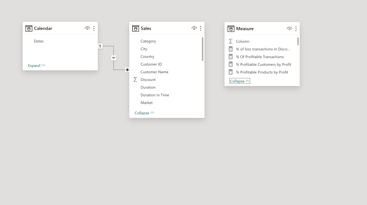
3. Creating Calculated Columns and Measures:
Next, we used Power BI’s front-end formula language, DAX, to analyze our relational data model and create several calculated columns (for filtering) and measures (for aggregation), that we could later reference and use when analyzing and visualizing the data.
We used calculated columns to determine whether a Profit Value is Positive/Negative, a Duration Column to calculate shipment time in days, and a Duration in Time column to check whether delivery was on time (Yes/No).
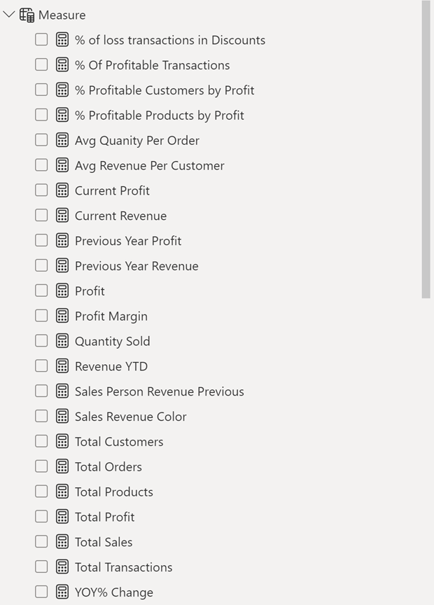
The list of calculated measures is available below:
4. Visualising the Data
The final step of the project was creating a multi-page interactive dashboard, including a range of visuals and KPIs that could serve management and lead to informed decision-making. We used several visuals and tools to demonstrate and visualize the data across the 12 report pages, including KPI cards, line and bar charts, matrices, gauge charts, maps, donut charts, and slicers. We made sure the report was fully interactive and simple to navigate, with icons used to enable filters, cancel filters, and easily guide users to each report page. Features such as drill-through, bookmarks, parameters, and tooltips were also used throughout the dashboard, further enhancing its usefulness and impact on management.
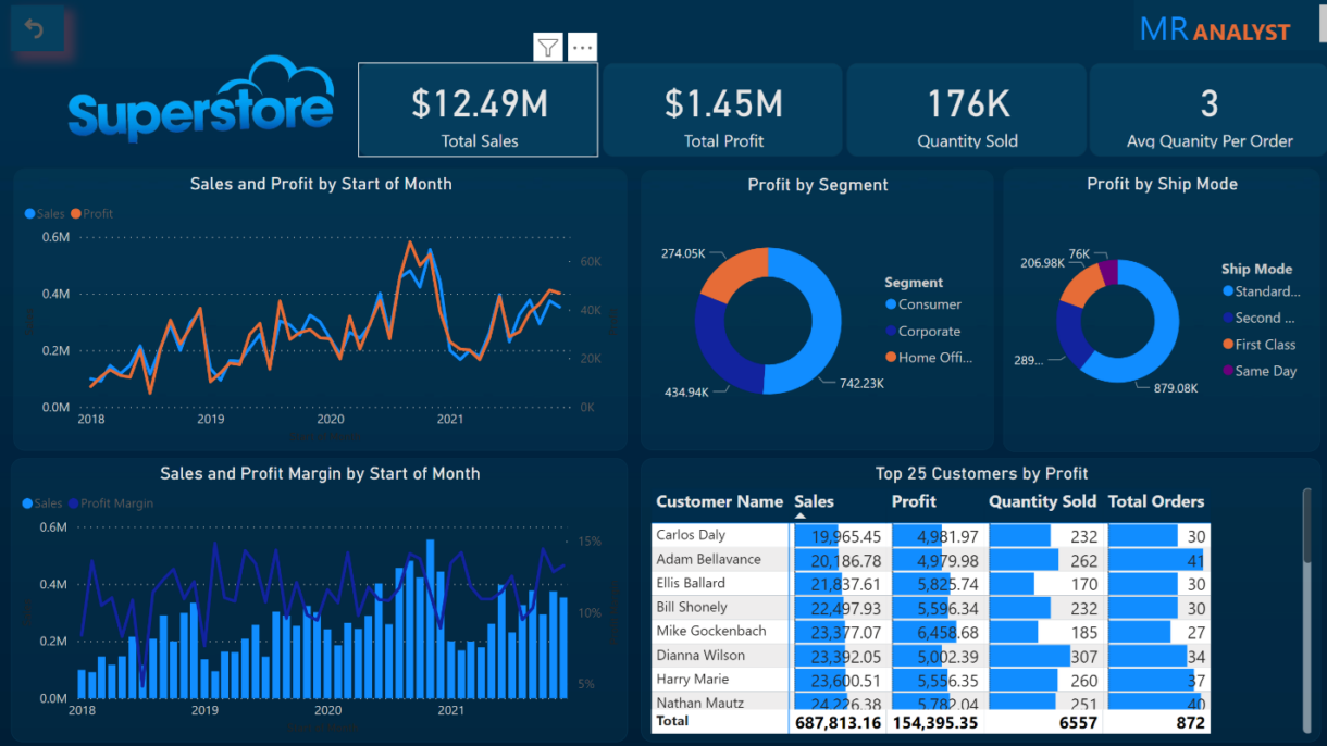
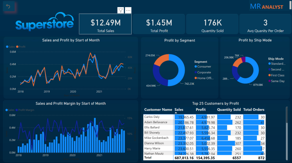
Executive Level Report: The first report page provides a high-level view of Global Super Store’s overall performance. We used card visuals to present Key Performance Indicators such as total sales, profit, quantity sold, and average quantity per order. We also included a line chart to visualize the trending sales and profit from 2018-2021 and highlight long-term performance and presented the number of orders by product category to aid in understanding product sales distribution, and used a further table to display the top 25 customers by profit
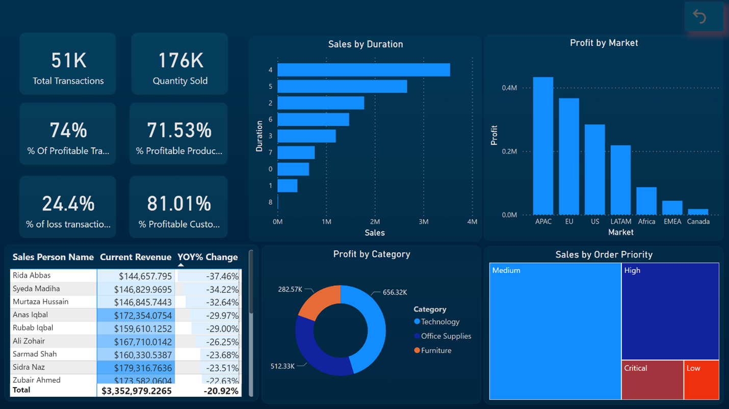
Key Insights Report: The second report page provides the important key points. We used card visuals to present % of Profitable Products, % of Profitable Customers, % of loss transactions and % of profitable transactions. We also included a bar chart to visualize shipment duration details and profit by Market, and presented donut chart to displace which category was more profitable and also included a Tree Map chart to Show sales by Order priority, and used further a table to display Sales Person Year on Year Revenue change.
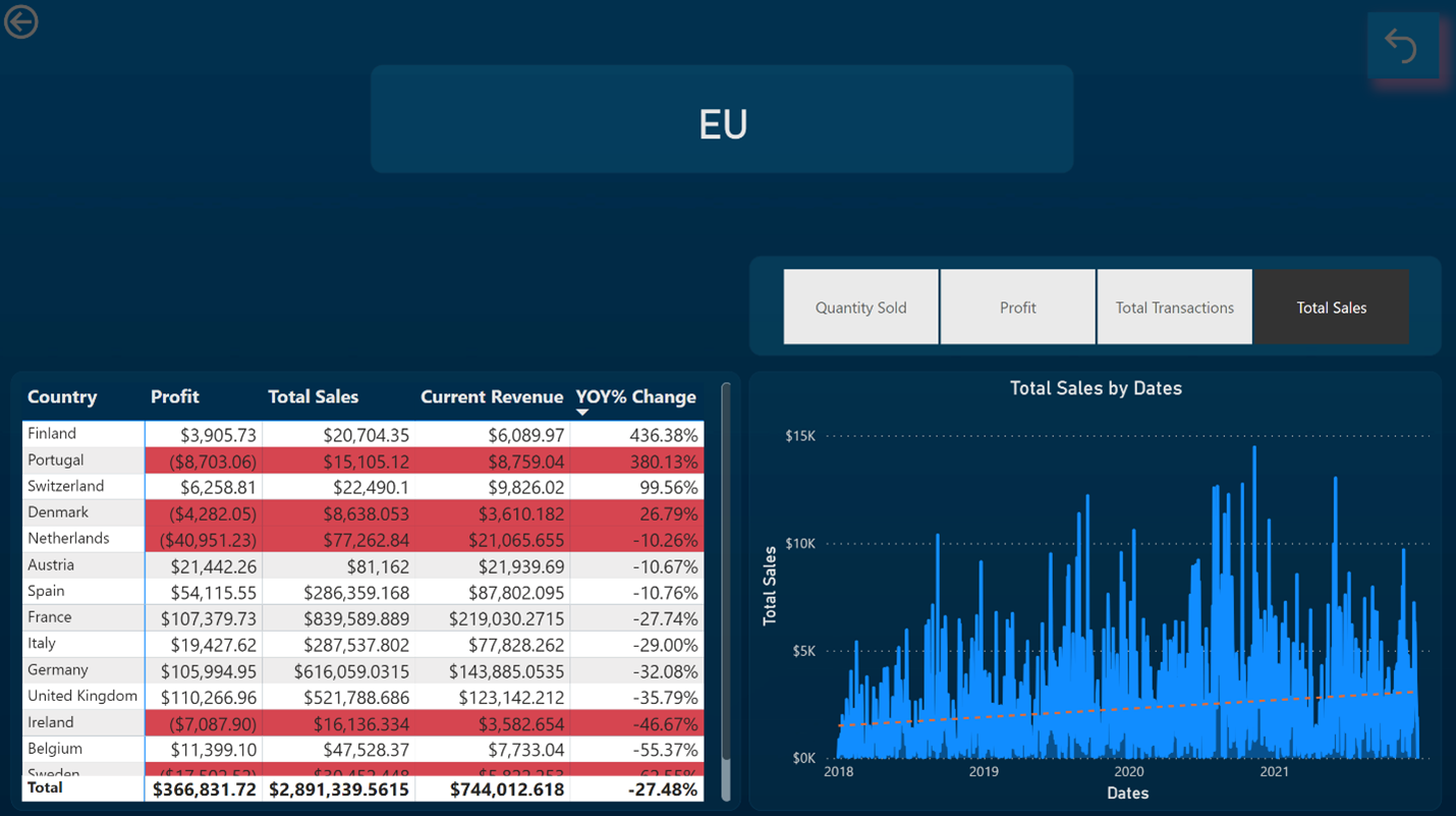
Market Level Report: This report depicts important points about Market. We used Line Chart to Display Total sales by dates on a specific Market, a table to display country level profit, sales and YOY% Change.
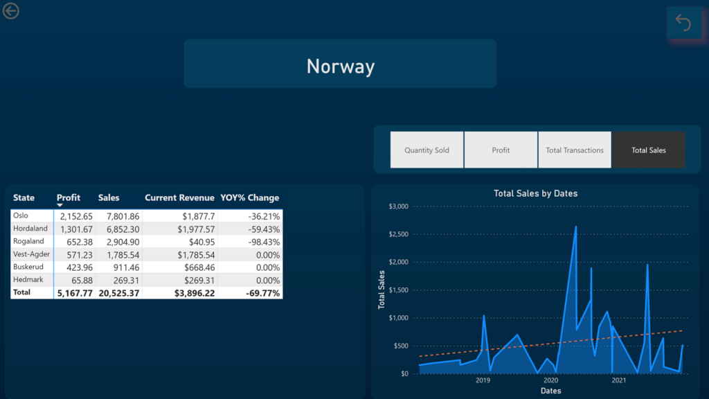
Country Level Report: The report provides information about Country Level Analysis. A line chart shows total sales on the specific country and further we included a table that shows state level profit, sales and YOY% Revenue change.
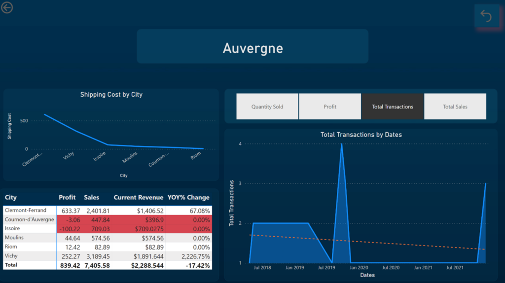
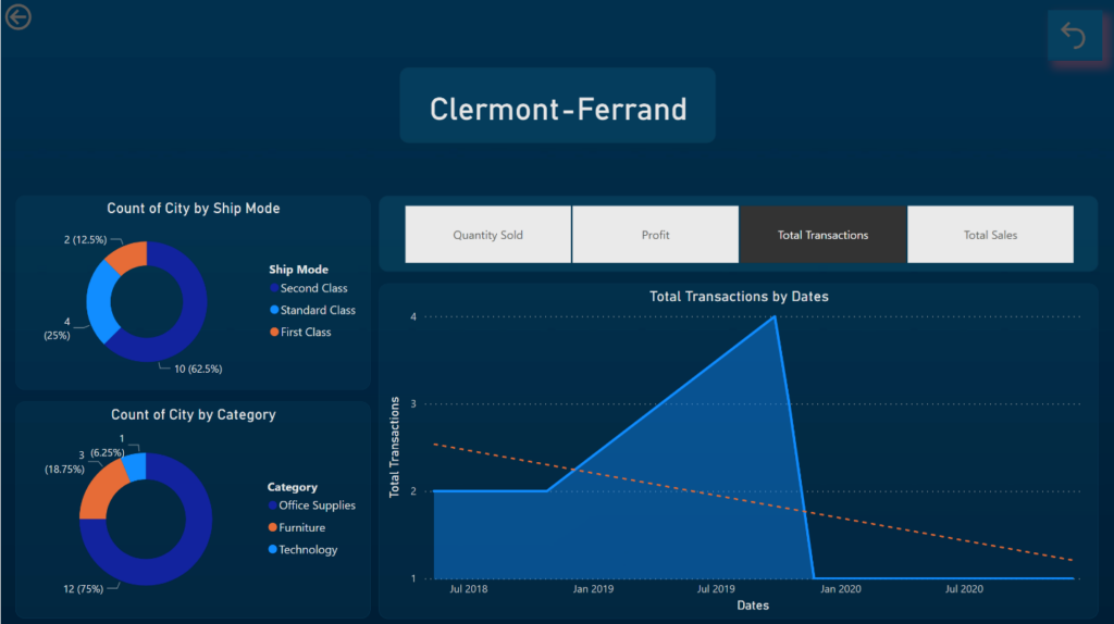
State and City Level Reports: These two pages provides overview of total sales by State and City Level. These two reports have the visual that were in Market and Country Level.
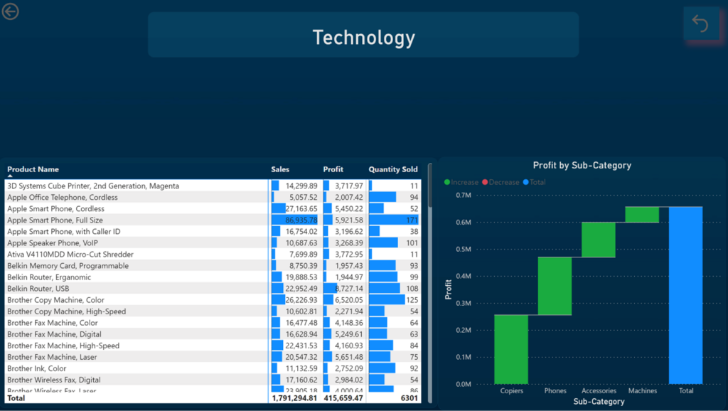
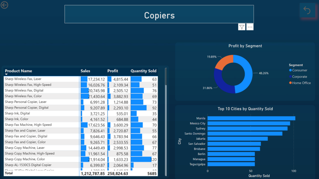
Category and Sub Category Level Report: These two reports displace category and sub category wise sales and profit and further a table is included to show Product wise sales, profit and quantity sold.
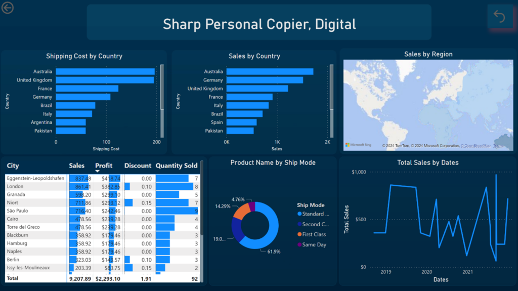
Product Level Report: The report is mainly about Product level analysis. Two bar charts were included to show country wise shipment cost and sales. A map chart to show which country has most sales, a donut chart to show product purchased by shipment mode and further a table was included to display city wise sales, profit, discount and quantity sold.
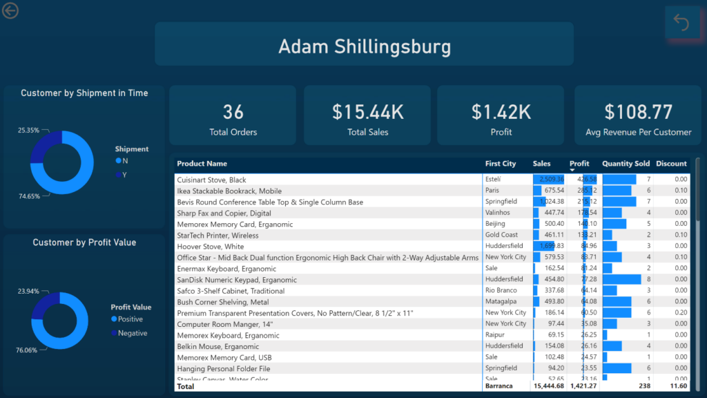
Customer Level Report: This report provides information about customer like how many orders a customer has done? How much sales and profit he has generated for the store. A donut chart to show is this customer a profitable customer or not?
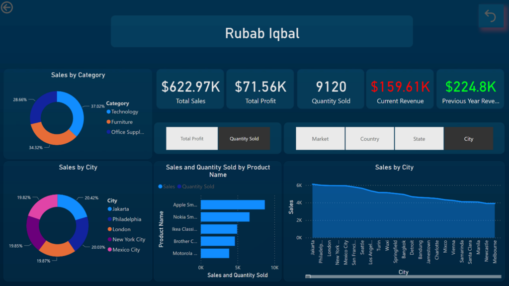
Sales Person Level Report: This report provides detail overview of sales person. We include 5 KPI cards to show total sales, total profit, quantity sold, previous year revenue and current year revenue. A area chart was created to show sales by city for the specific sales person, Further, we have included to donut charts and a bar chart to shows sales by category, city and product name.
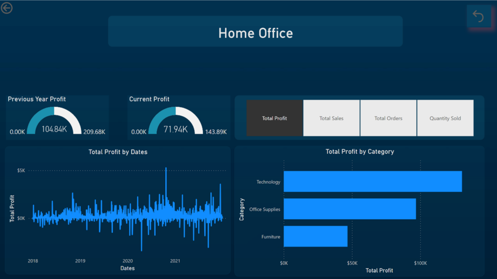
Segment Level Report: This report gives information about how much revenue does each segment has generated. We used two gauge chart to display current and previous year profit and further a bar chart to show category wise profit.