


Oodles of Noodles (Power BI)
The Situation:
Oodles of Noodles is a Meal Kit Delivery Service provider company. Our task is to derive meaningful insights into retail operations and customer behavior.
- Track KPIs (sales, shipments, profit, reviews)
- Compare regional performance
- Analyze product-level trends
- Identify high-value customers
- Analysis Subscription trends
The Data:
We’ve been given a collection of raw data (CSV files), which contain information about Meal Kits sold from 2020 to 2022
The Task: We are tasked with using solely Microsoft Power BI to:
- Connect and transform/shape the data in Power BI’s back-end using Power Query
- Build a relational data model, linking the fact and dimension table
- Create calculated columns and measures with DAX
- Design a multi-page interactive dashboard to visualize the data in Power BI’s front-end
The Process:
1. Connecting and Shaping the Data
Firstly, we imported the data into the Power Query editor to transform and clean it. The next process involved:
Removing Duplicates: Duplicate entries were removed from the dataset to ensure accurate analysis.
Handling Null or Missing Values: Missing values were replaced with defaults or averages for some columns. Null values in “key” columns were removed using filters.
Data Type Conversion: Columns were converted to appropriate data types to ensure consistency. Dates were converted to Date type, numerical columns to Decimal or Whole Numbers, and text columns to Text.
Column Splitting and Merging: Several columns were split to separate concatenated information, or merged to create a unified name (such as Customer Full Name).
Standardizing Date Formats: All date columns were formatted consistently to facilitate time-based analysis. This step was important for ensuring accurate time-series analysis in Power BI.
Removing Unnecessary Columns: Irrelevant columns were removed to streamline the dataset. This helped focus the analysis on relevant information, reducing memory usage and improving performance
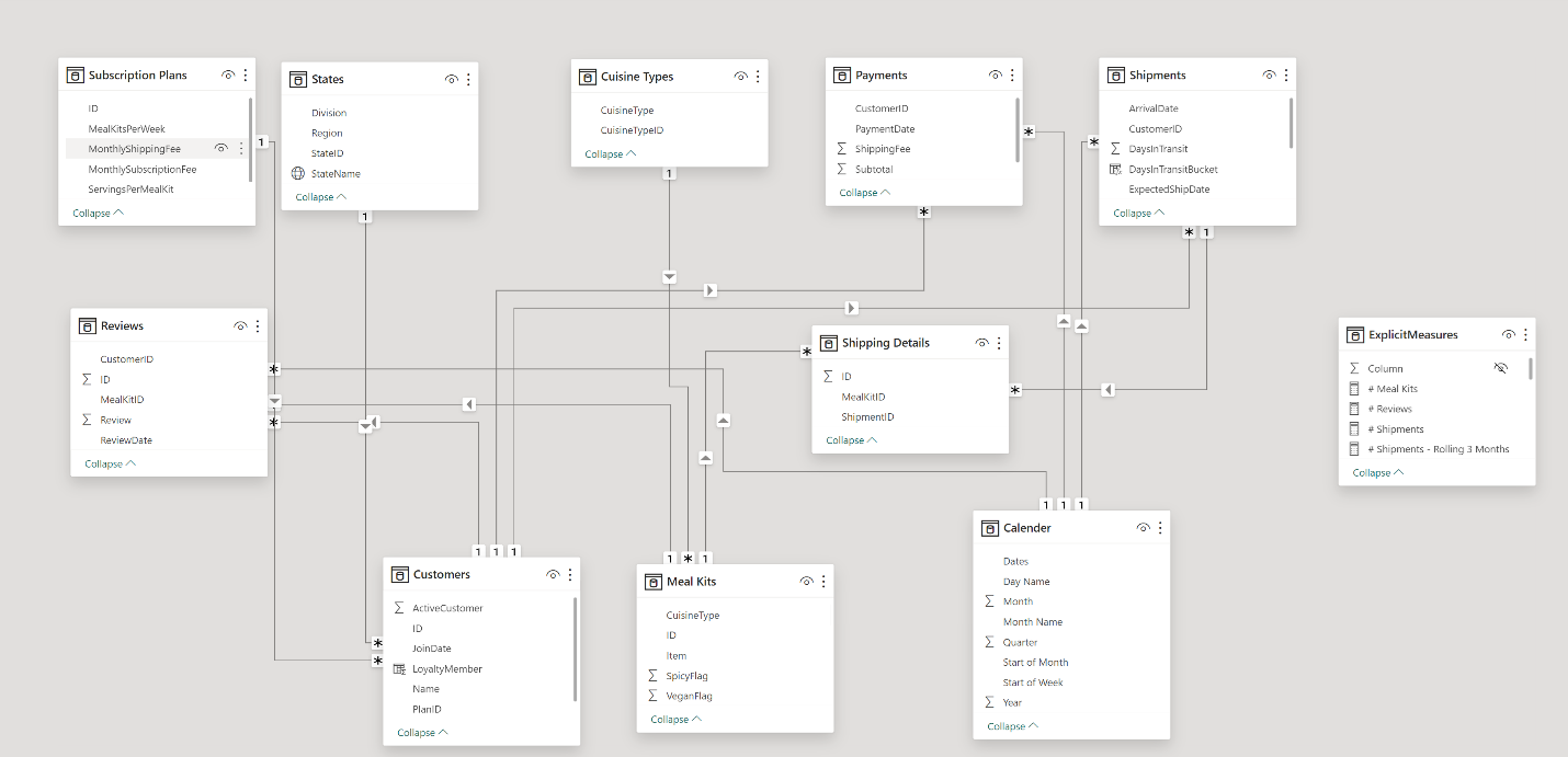
2. Building a Relational Data Model
Secondly, we modeled the data to create a snowflake schema. This process involved creating relationships between the dimension and fact tables, ensuring cardinalities were one-to-many relationships.
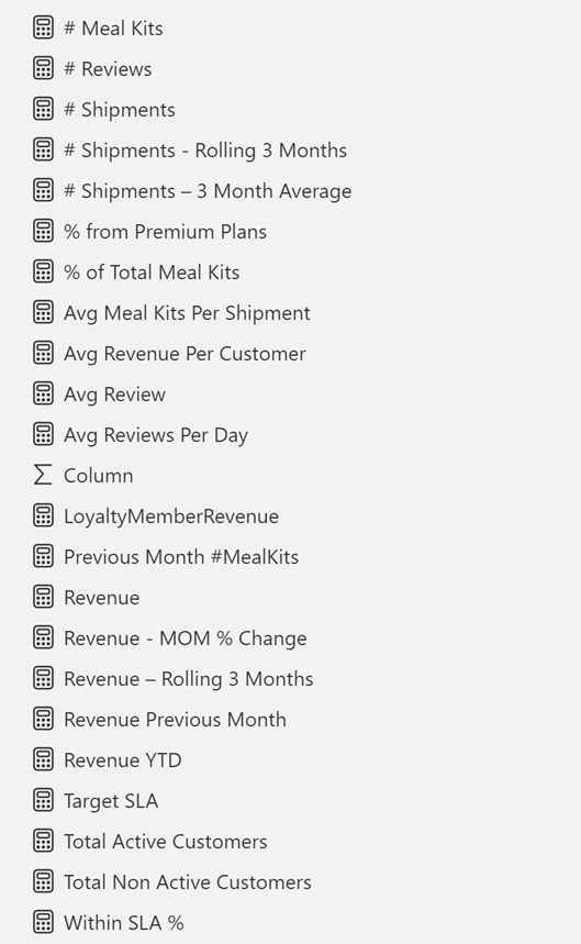
3. Creating Calculated Columns and Measures
Next, we used Power BI’s front-end formula language, DAX, to analyze our relational data model and create several calculated columns (for filtering) and measures (for aggregation), that we could later reference and use when analyzing and visualizing the data.
We used calculated columns like “DaysInTransit” to check Gap Between the Shipment date and the Arrival Date, a “Total” Column to calculate the subtotal, shipment charges plus tax and “ProcessingLag” Column to calculate date difference between ship date and expected ship date
The list of calculated measures is available below:
4. Visualising the Data
The final step of the project was creating a multi-page interactive dashboard, including a range of visuals and KPIs that could serve management and lead to informed decision-making. We used several visuals and tools to demonstrate and visualize the data across the 4 report pages, including KPI cards, line and bar charts, donut charts and a line chart with time forecasting. We made sure the report was fully interactive and simple to navigate, with icons used to enable filters, cancel filters, and guide users to each report page with ease.
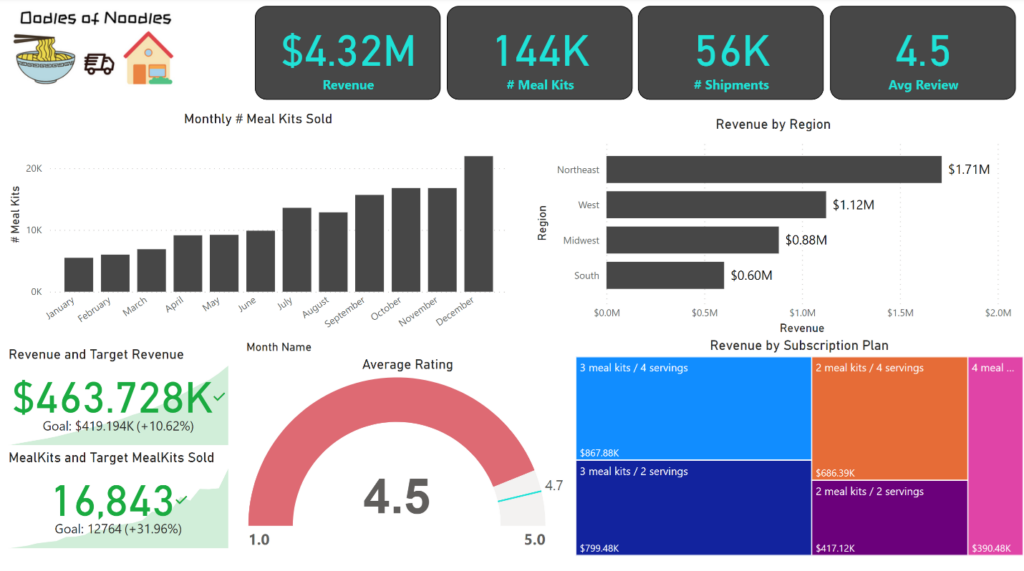
Executive Level Report: The first report page provides a high-level view of Oodles of Noodles overall performance. We used card visuals to present Key Performance Indicators such as Total Revenue, Number of Meal Kits sold, total shipments, average reviews. We also included a bar chart to show monthly meal kits sold and a column chart to Revenue generated in each region, we also used gauge chart to show average review and target review, a Tree Map to show Revenue generated Per Subscription Plan and further two KPI Chart to show Current Revenue and Target Revenue and also Current Meal Kits Sold and Target Meal Kits Sold.
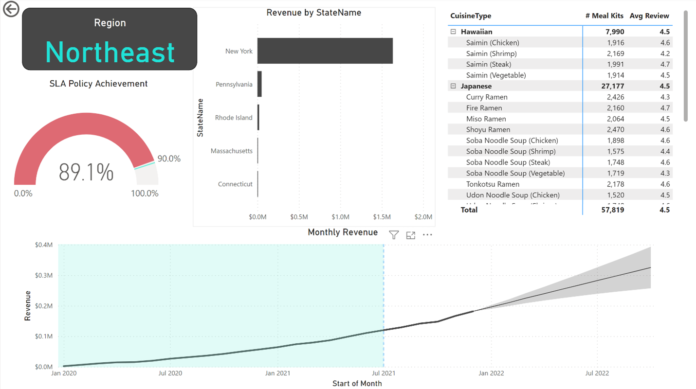
Regional Level Report: This Report is mainly about Regional Level Analysis. We used a Bar Chart to show State wise Revenue generated, a gauge chart to show SLA Policy Achievement in Percentage, a table to show Cuisine Type wise meal kits sold and average review for that particular meal kit and Region and further a line chart was added to show monthly revenue generated and upcoming 10 months predicted revenue using Forecasting in Power BI.
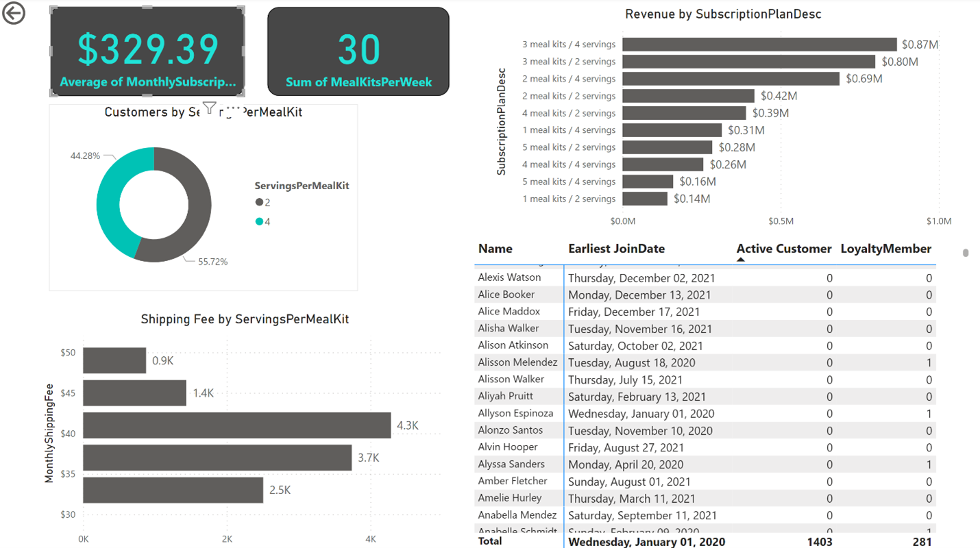
Subscription Level Report: This report provides information about Subscription Plan. We used a Bar chart to show Subscription Plan wise Revenue and find out Plan 3 meal kits / 4 serving has generated about 0.8 million dollars of revenue. Two cards are added to show average monthly subscription fee and total meal kits per week sold. A donut chart to show Servings per order and a column chart to display Shipping Fee per Meal Kit and further a table is used to show customer name, active member or not, loyalty member status and early joining date.
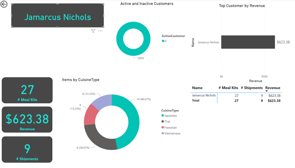
Customer Level Report: This report provides gives key points about customers. We used KPI cards to show customer name, meal kits purchased, revenue generated and shipments details. A Donut chart to show active or inactive customer and further again a donut chart to show which Cuisine Type customer has purchased most.